Variance in TV Viewing Figures
It is a fairly safe assumption that viewing figures for TV shows typically drop over time. But what I was thinking about this morning is how many people just turn on the TV and watch whatever is on, is that something we can work out from TV videwing figures?
To start with lets consider “Grey’s Anatomy”. The viewing figure data is from “ABC Medianet” and initially we just plot the number of viewers per episode which results in the below graph.
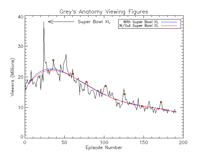
The first thing to notice in the above plot, is the large spike of around 38 million viewers for episode 24. This is caused by being the lead out show after Super Bowl XL. The brown circles plotted represent the start of a new season, as very often a new season (with the associated advertising) leads to a bump in viewing figures.
We can also see from the plot that over time the number of viewers for the show has steadily decreased. And the red and blue curves are polynomial fits to the data to try and track that change in viewers. The red curve ignores the viewing figure from after the Super Bowl, treating it as an outlier. To look at the variation in users we can subtract the overall trend of viewers from the data and just look at the “noise”.
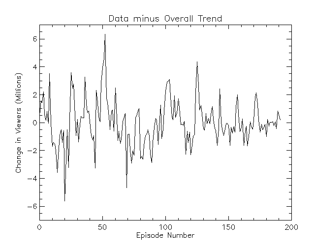
However, this “noise” also contains the trend of an increase in viewers at the start of a new season and this diminishing over the season. To try and remove this we look at the Hilbert-Huang transform of the data minus the trend, breaking the curve into 7 intrinsic mode functions (IMF):
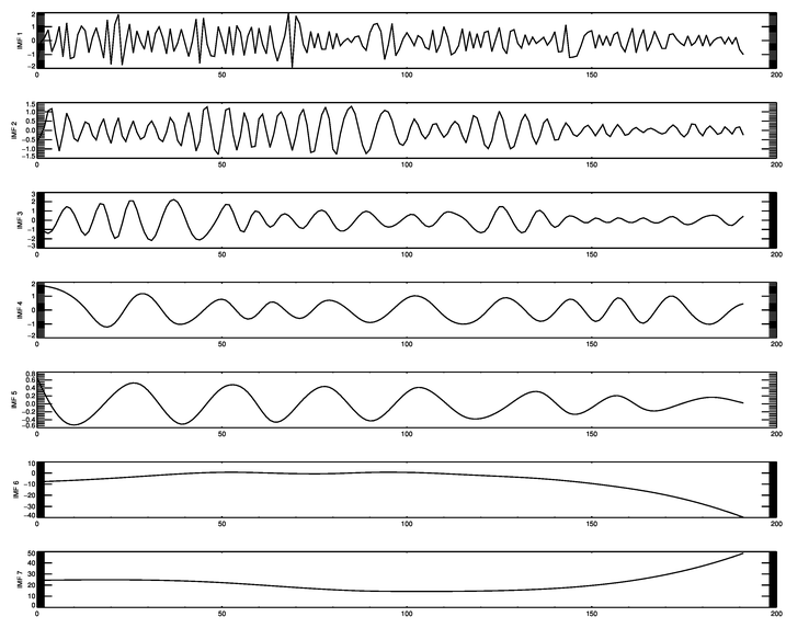
What we discover in the 4th IMF is the following trend, made larger below so it is more visible, with the red vertical lines indicating where a new season begins.
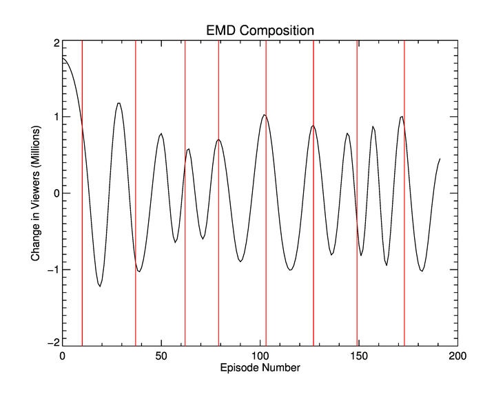
You can see that the peaks do not always match where a season begins (which was also reflected in the very first plot), but very often they do. This means that we can now plot the true “fluctuations” in viewer numbers by subtracting the above graph from our “noise” graph.
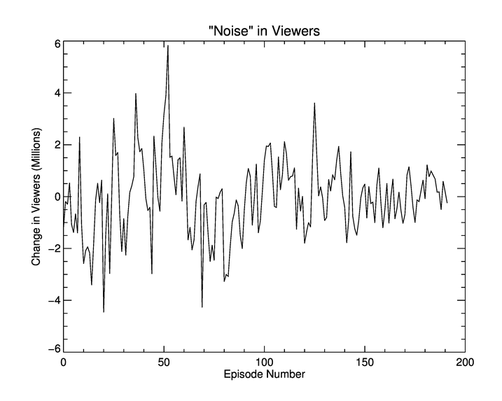
It looks like, in this plot, that the noise in viewing figures is decreasing over time. However since we know that there is a decreasing number of viewers we calculate the normalised standard deviation for each season. This is done by finding the standard deviation of a season and dividing it by the range of viewers for that season. This is presented in the table below.
| Season Number | Standard Deviation (Millions) | Range of Viewers (Million) | (Standard Deviation / Range ) \* 100 (%) |
| :-----------: | :---------------------------: | :------------------------: | :--------------------------------------: |
|       1       |             1.19              |            5.97            |                  19.99                   |
|       2       |             1.71              |            9.72            |                  17.60                   |
|       3       |             1.82              |            8.88            |                  20.45                   |
|       4       |             1.39              |            6.82            |                  20.31                   |
|       5       |             1.43              |            5.36            |                  26.76                   |
|       6       |             1.34              |            7.16            |                  18.70                   |
|       7       |             1.09              |            5.19            |                  21.10                   |
|       8       |             0.66              |            3.93            |                  16.88                   |
|       9       |             0.59              |            3.56            |                  16.67                   |
The percentage column has a mean value of 19.83% itself with a standard deviation of 3.06%. So we can conslude that the standard deviation of the noise in viewers is about 20% of the range of viewers. Is this a “standard value”? Or is it somehow tied to Grey’s Anatomy?
Below I have generated the same plots as above for the shows ‘How I Met Your Mother’ and ‘Desperate Housewives’ which can be seen in the following galleries:
How I Met Your Mother:


Desperate Housewives:


Desperate Housewives shows a similar pattern to Grey’s Anatomy in terms of the overall viewing figure trend. Increasing initially and then dropping off. ‘How I Met Your Mother’, however, shows a different pattern. Although there are less viewers, the numbers remain fairly constant throughout the show.
From the above analysis we get a standard deviation (as a percentage of the range of viewers) as 17.17% (with a standard deviation of ~2.82%) for Desperate Housewives and 21.90% (standard deviation of 2.95%) for How I Met Your Mother.
So the three values we’ve got are 19.83%, 17.17% and 21.90%. Giving an average of 19.63%, well three examples are enough for me! It certainly hints at the fact that the spread of noise in viewing figures is independent of the show, and may be a fact of TV viewing figures.
Enjoy Reading This Article?
Here are some more articles you might like to read next: