Modified Taylor Diagrams
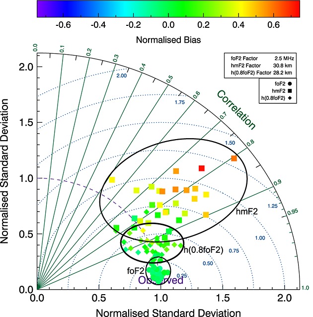
Taylor diagrams are a nice way of visualizing validation results of a variety of models. The diagrams can be used to graphically summarize how close a set of patterns (in this case a set of models) match observations. This is done by plotting the standard deviation of the time series of the model values, against the correlation (the Pearson product-moment correlation) between the time series of the model values and the observations. Exploiting the geometric relationship between correlation and standard deviation we can also plot the standard deviation of the model error.

Whilst Taylor originally used the “centered pattern RMS difference” my approach (as described in this paper) is to use the standard deviation of the model errors, a more commonly undertstood term. Additionally Taylor’s original approach did not allow for the plotting of model biases, I have added this via a colour scale.
Python code to make your own modified Taylor diagrams is avaialble here.
Enjoy Reading This Article?
Here are some more articles you might like to read next: