I recently started watching Grey’s Anatomy which I’ve been enjoying. However a friend of mine told me that the later episodes are not as good. So I thought I would have a look if the viewing figures reflected this.
The viewing figure data is from ABC Medianet and initially we just plot the number of viewers per episode which results in the below graph.
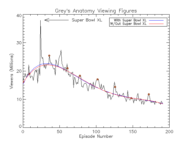 The first thing to notice in the above plot, is the large spike of around 38 million viewers for episode 24. This is caused by being the lead out show after Super Bowl XL. The brown circles plotted represent the start of a new season, as very often a new season (with the associated advertising) leads to a bump in viewing figures.
We can also see from the plot that over time the number of viewers for the show has steadily decreased. And the red and blue curves are polynomial fits to the data to try and track that change in viewers. The red curve ignores the viewing figure from after the Super Bowl, treating it as an outlier. To look at the variation in users we can subtract the overall trend of viewers from the data and just look at the “noise”.

However, this “noise” also contains the trend of an increase in viewers at the start of a new season and this diminishing over the season. To try and remove this we look at the Hilbert-Huang transform of the data minus the trend, breaking the curve into 7 intrinsic mode functions (IMF):
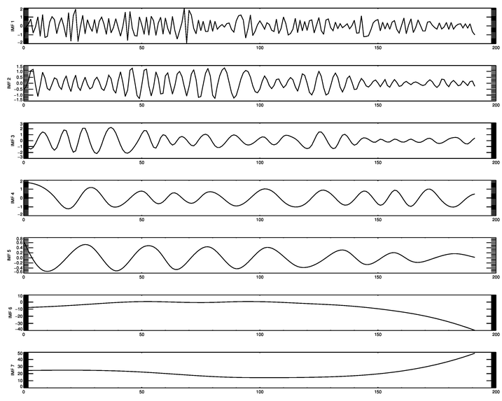
What we discover in the 4th IMF is this trend. Below it is made larger so it is more visible, with the red vertical lines indicating where a new season begins.
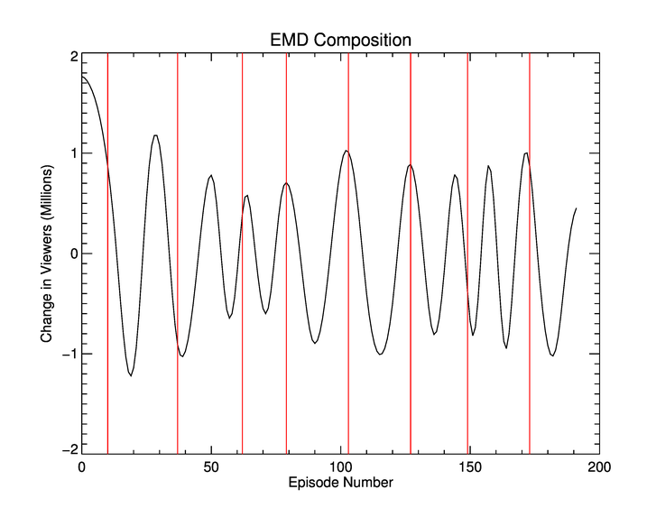
You can see that the peaks do not always match where a season begins (which was also reflected in the very first plot), but very often they do. This means that we can now plot the true fluctuations in viewer numbers by subtracting the above graph from our “noise” graph.
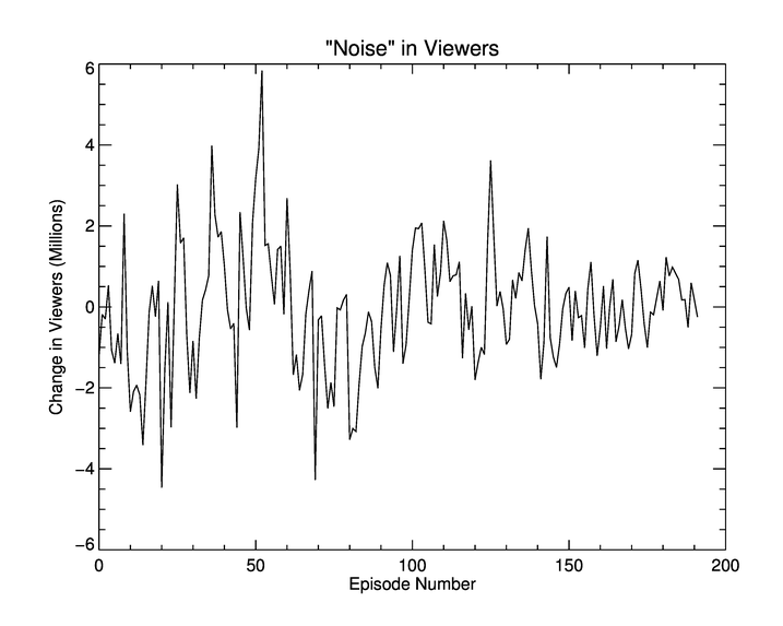 It looks like, in this plot, that the noise in viewing figures is decreasing over time. However since we know that there is a decreasing number of viewers we calculate the normalised standard deviation for each season. This is done by finding the standard deviation of a season and dividing it by the range of viewers for that season. This is presented in the table below.
| Season Number | Standard Deviation (Millions) | Range of Viewers (Million) | (Standard Deviation / Range ) * 100 (%) |
| 1 | 1.19 | 5.97 | 19.99 |
| 2 | 1.71 | 9.72 | 17.60 |
| 3 | 1.82 | 8.88 | 20.45 |
| 4 | 1.39 | 6.82 | 20.31 |
| 5 | 1.43 | 5.36 | 26.76 |
| 6 | 1.34 | 7.16 | 18.70 |
| 7 | 1.09 | 5.19 | 21.10 |
| 8 | 0.66 | 3.93 | 16.88 |
| 9 | 0.59 | 3.56 | 16.67 |
The percentage column has a mean value of 19.83% itself with a standard deviation of 3.06. We can conclude that the standard deviation of the noise in viewers is about 20% of the range of viewers. It will be interesting to see if this percentage is a “standard value”, that is, that it is also true of other TV shows.
To conclude with it is useful to note that as the number of viewers drops off, as should be expected, the overall season ranking of Grey’s Anatomy drops. At its peak Grey’s received an overall ranking of 5th place, on conclusion of last season this had fallen to 34th. However its drop in rank in the 18-49 age group is noticeably slower.
 Where the dashed lines are polynomials fit to the data (again from ABC Medianet). It is because of this strong showing in the 18-49 age category that I expect Grey’s Anatomy to not be forced off the air anytime soon. In terms of ad buys the 18-49 category is key, and a show which has a good showing in this category is still financially viable.